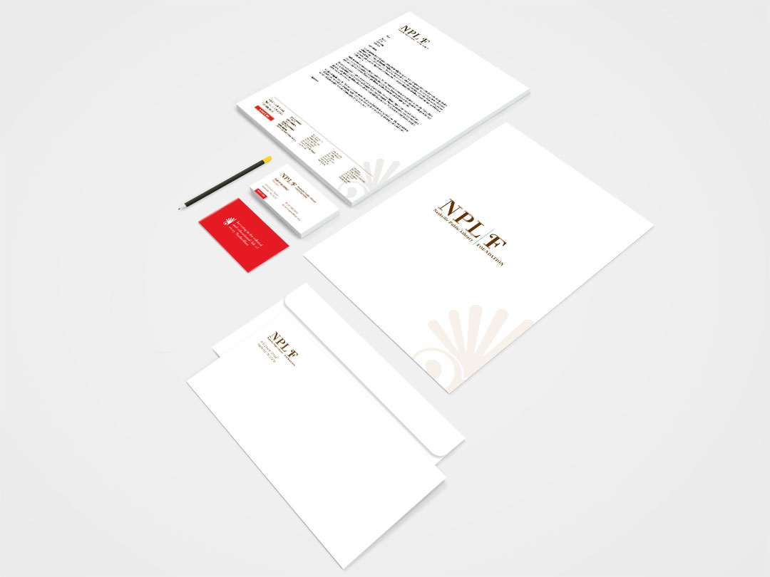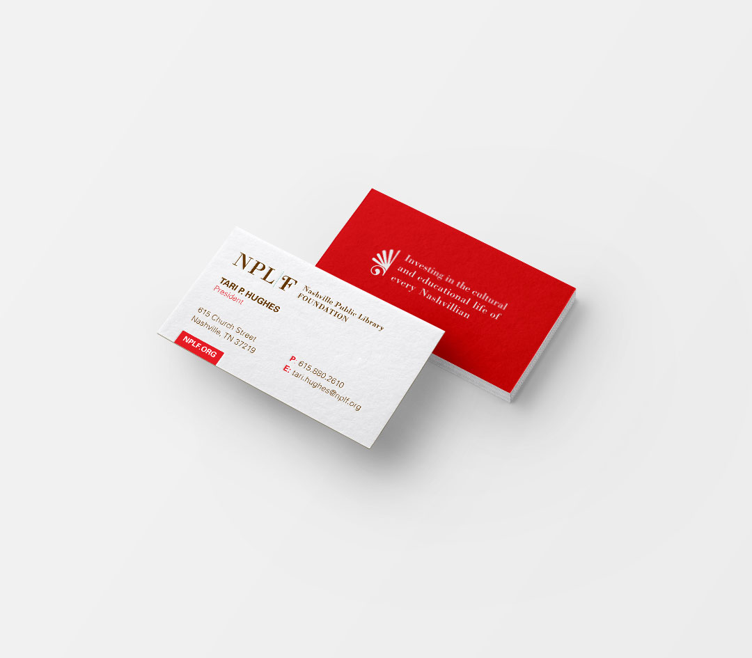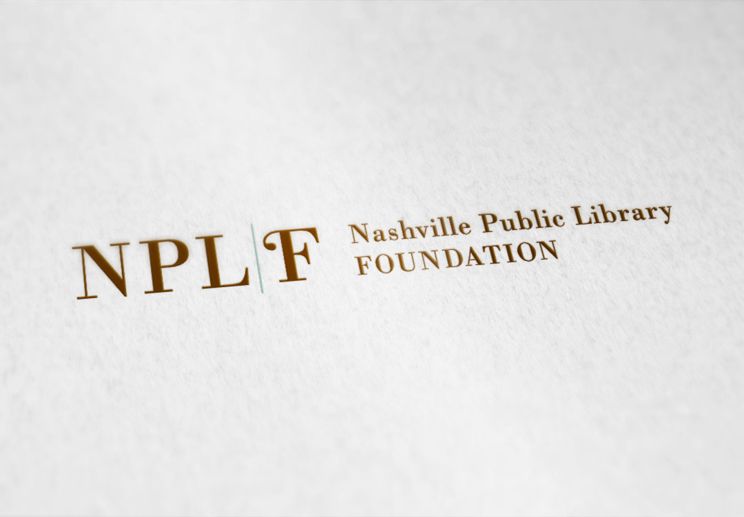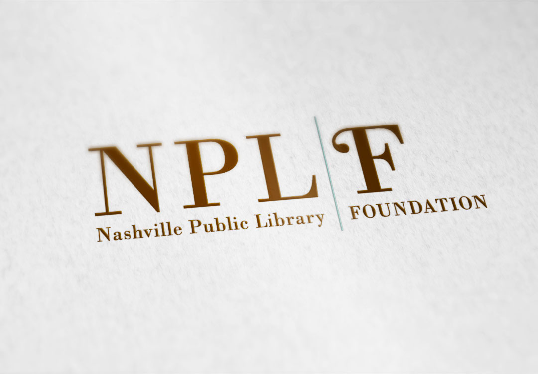
The Nashville Public Library Foundation was a rebranding project in which the client was looking to communicate two messages: that they are associated with the Nashville Public Library, but also operate as an independent organization. A simple colored line was created with a contemporary typeface to communicate that exact message.
Street Address
City, State, Zip
Phone Number
Your Custom Text Here